AI-Assisted Brand Identity Redesign
Brand: Sephora
Type: Brand Strategy / Visual Identity
This project was completed as part of a graduate-level marketing course at Clark Atlanta University. While academic in origin, the strategic framework, brand analysis, and design direction reflect an independent approach to a real brand challenge.
Overview
This project explored what happens when you look beyond a logo's aesthetics and into its origin story. The Sephora name derives from Zipporah, a biblical figure whose name means beauty. The existing flame icon, while iconic, offers no visible connection to that meaning. The goal of this redesign was to add a layer of intentional storytelling without disrupting one of the most recognizable marks in retail beauty.
The Strategic Direction
Rather than replacing the flame, the redesign works within it. A woman's profile is formed from negative space along the flame's left edge, allowing her nose, lips, and chin to emerge naturally from the existing shape. The result is a logo that rewards a second look. At first glance, it reads as the familiar Sephora flame. On closer inspection, the face of beauty is already there.
What Stayed the Same
The black-and-white color palette, the SEPHORA wordmark, and the mark's overall weight and proportions were all preserved. Brand equity at Sephora's level is not something to discard. The goal was addition, not replacement.
The Result
A mark that connects the brand's visual identity to its meaning, giving the logo depth it did not previously have while remaining instantly recognizable to existing customers.
Sephora- Original Logo
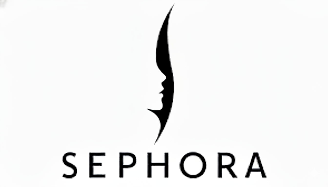
Redesign Version 1