AI-Assisted Brand Identity Redesign
Brand: Clark Atlanta University
This project was completed as part of a graduate-level marketing course at Clark Atlanta University. While academic in origin, the strategic framework, brand analysis, and design direction reflect an independent approach to real brand challenges.
Overview
This project explored how strategic prompting and brand thinking can guide AI-assisted design toward a more intentional visual identity. The goal was not simply to generate a new logo but to identify what the existing mark communicated, to whom, and what a more enduring version of the CAU brand could look like.
The Original Logo
The current CAU logo features an asymmetrical side-profile panther, aggressive speed lines, and a gradient-heavy aesthetic rooted in early 2000s sports design. While energetic, the mark feels dated and limits its versatility across modern applications, including digital platforms, merchandise, and institutional materials.
The Strategic Direction
The redesign pivoted toward a symmetrical, front-facing panther anchored by a shield emblem. Every decision was intentional. The front-facing composition signals confidence and composure rather than aggression. The shield grounds the mascot in academic tradition. The flat vector style and a strict palette of cardinal red, black, and white ensure the mark remains legible at any size, for all forms of paraphernalia.

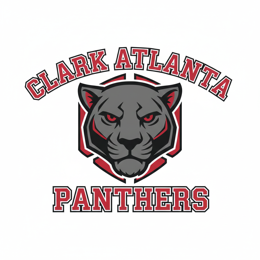
CAU- Original Logo
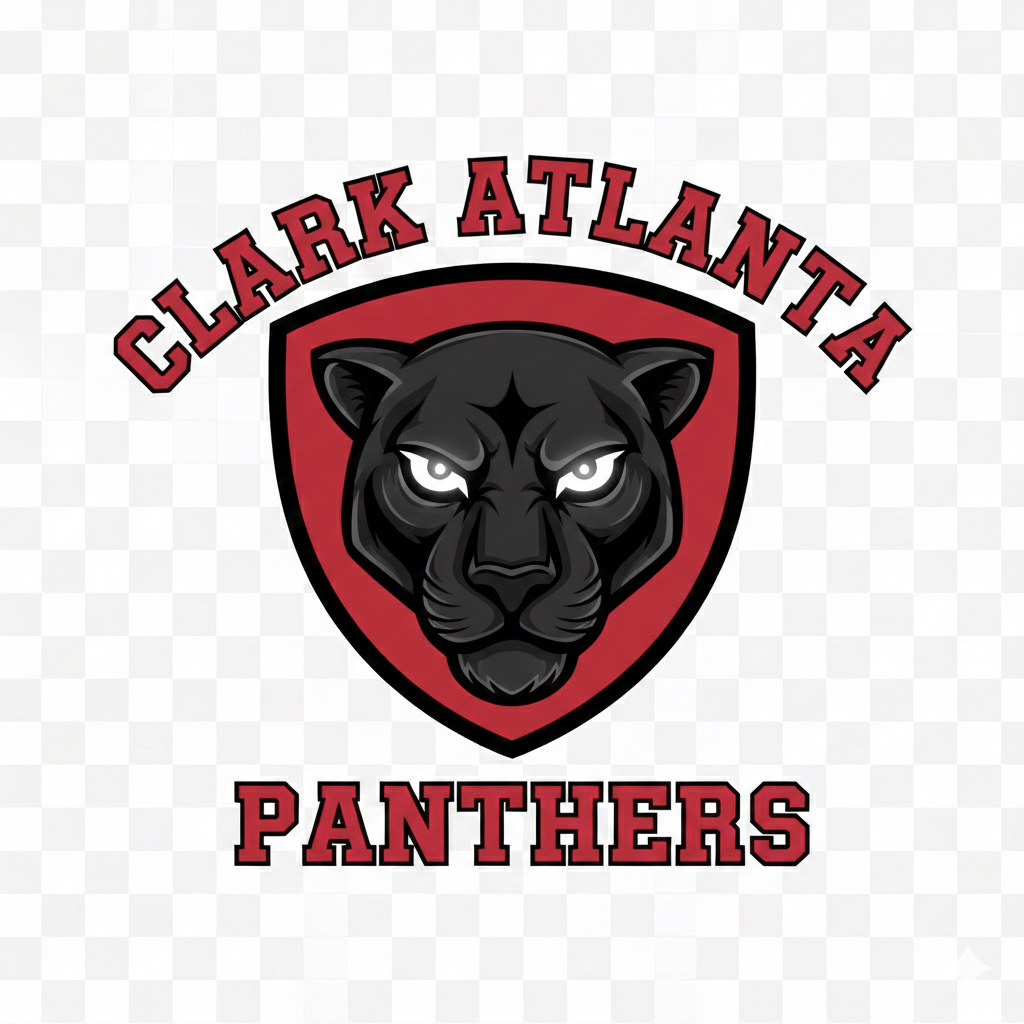
Redesign Version 1
Redesign Version 2